NexusButton
The NexusButton class is the complete button using
ColoredCutFrames and other internal classes.
Creating NexusButton
NexusButton is created and set up similarly to Frames.
No adorn frame is needed, and properties can be directly
set and read from with the object.
local NexusButton = require(game.ReplicatedStorage:WaitForChild("NexusButton"))

--Create a ScreenGui.
local ScreenGui = Instance.new("ScreenGui")
ScreenGui.Parent = game:GetService("Players").LocalPlayer:WaitForChild("PlayerGui")

--Create a button.
local Button = NexusButton.new()
Button.Size = UDim2.new(0,200,0,40)
Button.Position = UDim2.new(0,50,0,50)
Button.Parent = ScreenGui
By default, the BorderSizePixel is set to 0,
but a border appears because of a custom property
added called BorderSizeScale, which defaults to 0.2.
Both can be used concurrently like a UDim.
Setting Colors
Like regular buttons, the background color can be set
to a Color3 for both the BackgroundColor3 and
BorderColor3. Additionally, the BorderTransparency
can be set.
local NexusButton = require(game.ReplicatedStorage:WaitForChild("NexusButton"))

--Create a ScreenGui.
local ScreenGui = Instance.new("ScreenGui")
ScreenGui.Parent = game:GetService("Players").LocalPlayer:WaitForChild("PlayerGui")

--Create a button.
local Button = NexusButton.new()
Button.Size = UDim2.new(0,200,0,40)
Button.Position = UDim2.new(0,50,0,50)
Button.BackgroundColor3 = Color3.new(0,170/255,255/255)
Button.BorderColor3 = Color3.new(0,140/255,225/255)
Button.BorderTransparency = 0.25
Button.Parent = ScreenGui

Adding Children
Adding children isn't as straight forward since the class
is a table. This means direct parenting will result in an error.
A frame that can be used to parent items can be obtained using
NexusButton:GetAdornFrame().
local NexusButton = require(game.ReplicatedStorage:WaitForChild("NexusButton"))

--Create a ScreenGui.
local ScreenGui = Instance.new("ScreenGui")
ScreenGui.Parent = game:GetService("Players").LocalPlayer:WaitForChild("PlayerGui")

--Create a button.
local Button = NexusButton.new()
Button.Size = UDim2.new(0,200,0,40)
Button.Position = UDim2.new(0,50,0,50)
Button.BackgroundColor3 = Color3.new(0,170/255,255/255)
Button.BorderColor3 = Color3.new(0,140/255,225/255)
Button.BorderTransparency = 0.25
Button.Parent = ScreenGui

--Add a text label.
local TextLabel = Instance.new("TextLabel")
TextLabel.Size = UDim2.new(1,0,0.9,0)
TextLabel.AnchorPoint = Vector2.new(0.5,0.5)
TextLabel.Position = UDim2.new(0.5,0,0.5,0)
TextLabel.BackgroundTransparency = 1
TextLabel.ZIndex = 5
TextLabel.Font = Enum.Font.SourceSansBold
TextLabel.TextColor3 = Color3.new(1,1,1)
TextLabel.TextStrokeColor3 = Color3.new(0,0,0)
TextLabel.TextStrokeTransparency = 0
TextLabel.TextScaled = true
TextLabel.Text = "Button"
TextLabel.Parent = Button:GetAdornFrame()

Controller Icons
Controller icons can be added to the button using
NexusButton:SetControllerIcon(KeyCode). To make
the mouse events get triggered by the controller icon,
NexusButton:MapKey(KeyCode,MouseInput). Note that
controller icons only show when a controller is detected.
local NexusButton = require(game.ReplicatedStorage:WaitForChild("NexusButton"))

--Create a ScreenGui.
local ScreenGui = Instance.new("ScreenGui")
ScreenGui.Parent = game:GetService("Players").LocalPlayer:WaitForChild("PlayerGui")

--Create a button.
local Button = NexusButton.new()
Button.Size = UDim2.new(0,200,0,40)
Button.Position = UDim2.new(0,50,0,50)
Button.BackgroundColor3 = Color3.new(0,170/255,255/255)
Button.BorderColor3 = Color3.new(0,140/255,225/255)
Button.BorderTransparency = 0.25
Button.Parent = ScreenGui

--Set up the controller button.
Button:SetControllerIcon("ButtonA")
Button:MapKey("ButtonA","MouseButton1")

--Add a text label.
local TextLabel = Instance.new("TextLabel")
TextLabel.Size = UDim2.new(1,0,0.9,0)
TextLabel.AnchorPoint = Vector2.new(0.5,0.5)
TextLabel.Position = UDim2.new(0.5,0,0.5,0)
TextLabel.BackgroundTransparency = 1
TextLabel.ZIndex = 5
TextLabel.Font = Enum.Font.SourceSansBold
TextLabel.TextColor3 = Color3.new(1,1,1)
TextLabel.TextStrokeColor3 = Color3.new(0,0,0)
TextLabel.TextStrokeTransparency = 0
TextLabel.TextScaled = true
TextLabel.Text = "Button"
TextLabel.Parent = Button:GetAdornFrame()

--Connect the events.
Button.MouseButton1Down:Connect(function()
    print("Mouse button 1 down.")
end)

Button.MouseButton1Up:Connect(function()
    print("Mouse button 1 up.")
end)

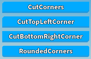
Themes
Basic themes are supported by Nexus Button, which are used to change the appearance.
local NexusButton = require(game.ReplicatedStorage:WaitForChild("NexusButton"))

--Create a ScreenGui.
local ScreenGui = Instance.new("ScreenGui")
ScreenGui.Parent = game:GetService("Players").LocalPlayer:WaitForChild("PlayerGui")

--Create a button.
for i, ThemeName in pairs({"CutCorners","CutTopLeftCorner","CutBottomRightCorner","RoundedCorners"}) do
    local Button = NexusButton.new()
    Button.Size = UDim2.new(0,350,0,40)
    Button.Position = UDim2.new(0,50,0,60 * i)
    Button.BackgroundColor3 = Color3.new(0,170/255,255/255)
    Button.BorderColor3 = Color3.new(0,140/255,225/255)
    Button.BorderTransparency = 0.25
    Button.Theme = ThemeName
    Button.Parent = ScreenGui

    local TextLabel = Instance.new("TextLabel")
    TextLabel.Size = UDim2.new(1,0,0.9,0)
    TextLabel.AnchorPoint = Vector2.new(0.5,0.5)
    TextLabel.Position = UDim2.new(0.5,0,0.5,0)
    TextLabel.BackgroundTransparency = 1
    TextLabel.ZIndex = 5
    TextLabel.Font = Enum.Font.SourceSansBold
    TextLabel.TextColor3 = Color3.new(1,1,1)
    TextLabel.TextStrokeColor3 = Color3.new(0,0,0)
    TextLabel.TextStrokeTransparency = 0
    TextLabel.TextScaled = true
    TextLabel.Text = ThemeName
    TextLabel.Parent = Button:GetAdornFrame()
end